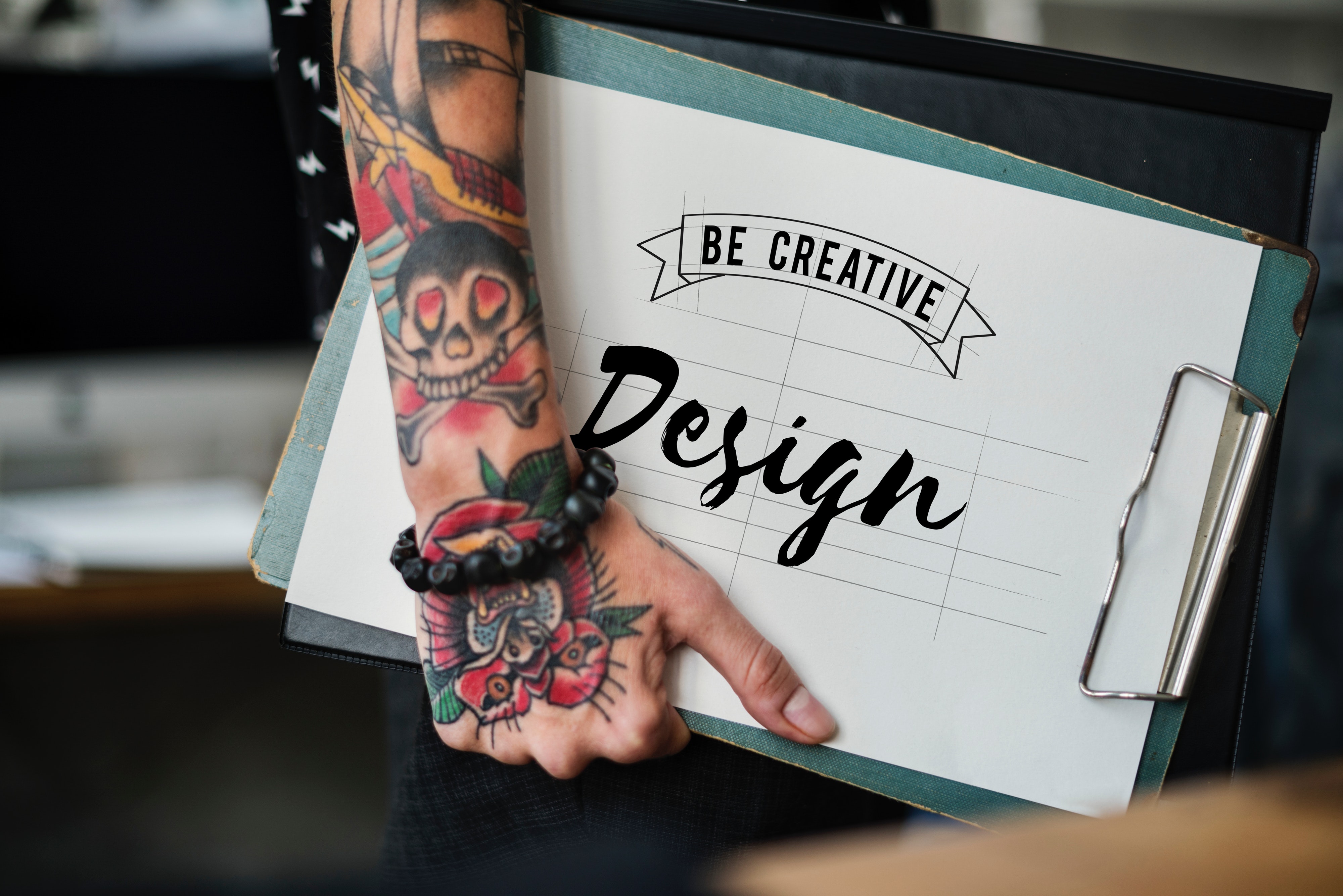
By: Jackie Greer
So you want to run an ad… what’s the point? Is it to tell your next customer or client ALL of the wonderful things there is to know about your business or product? Believe it or not, that’s exactly what many business owners, managers and sales representatives are inclined to do. However, as much as you may want to share all of the fabulousness about your business or product, resist the urge and just say, “No!”
Here are 5 tips I encourage my clients to consider when creating effective and creative ad design across all mediums:
Define the purpose of your ad.
Before you begin creating your ad, it’s important to understand the purpose behind the ad. An ad with no purpose can result in money wasted. Maybe your ad is a general ad to increase brand awareness such as, “we’re Greer Force Marketing and we’re experts in all things marketing” or maybe its purpose is to promote a specific call to action such as taking advantage of a sale by a specific deadline. Whatever the purpose of the ad is, make sure your message is clear and concise. You don’t have to tell the reader everything about your business, nor would you want to. At the end of the day your ad should draw interest for the reader to want to learn more.
An image is worth a thousand words.
There is no replacement for a stellar graphic or amazing photography. Some of the most powerful ads consist of bold images that cause the reader to feel something. Maybe it’s recalling a childhood memory or maybe it ignites a passion or desire to go after a dream. Maybe, it will cause you to want to swing by the convenient store to pick up your favorite snack on the way home from the office because you had a stressful day.
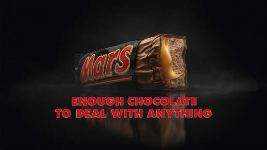
Read more about the Mars Bar’s new ‘Enough to Deal with Anything’ brand platform that tackles real life awkward moments.
Whatever the message of your ad, keep the words to a minimum and rely on your images and graphics to generate a response from your reader.
Don’t underestimate the power of White Space (or negative space).
Simply stated, white space is the area between design elements within an individual design layout. You’ve heard the saying, “less is more.” Many clients feel white space is lost space but this couldn’t be further from the truth. White space brings balance to design elements and organizes content to improve the overall experience. People are busy. They’re constantly being bombarded with having to make decisions. They want information, they want it fast, and they want to know how it pertains to them. You have to gain and keep the reader’s attention; white space keeps the reader engaged without feeling overwhelmed. Utilizing white space effectively creates simple and uncluttered creative design with a solid message.
Use Simple Typography.
We’ve all seen it – the creative that looks like a typography explosion just took place. Stop – don’t do it! Pick one artsy font to make a statement and use it on one word or phrase and then stick to basic, basic, basic fonts such as sans serif for all other typography. This typography helps make your design easy to see and read. Try to avoid drop shadows and shading as many times these effects can cause confusion and muddy visual communication. Type should be clear and should require little effort to engage the reader. As a rule of thumb, limit type to 2 unique typefaces within a design. This is a best practice amongst designers that create successful creative.
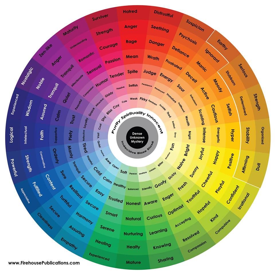
Color – it’s more than a feeling.
There is no disputing that colors can help stir genuine emotions inside the human brain and soul. Red is associated with love and sometimes anger. It’s bold, strong and confident. Blue – many times is associated with loyalty, security, and contentment. Yellow can be associated with joy, positivity, and energy. Chances are, if you were to close your eyes and think of a color, you could probably also associate a feeling with that color. When creating engaging designs these ideas are important to keep in mind. We FEEL with color but there is also a theory behind how the brain processes color. Two of the most common color composition options when dealing with any type of design are as follows:
- Analogous Colors Schemes
- Complementary Color Schemes
Analogous color schemes are any three or more colors that are side by side on the color wheel. For example, on the wheel below, the blue and green shades are all analogous colors. Complementary colors are any colors that are directly across from each other on the color wheel. Yellow and Purple, Blue and Orange, and Red and Green are all complementary colors. The brain subconsciously finds order and harmony in these color schemes making it easy to process and experience the “feelings” we feel from color. Be sure to never neglect the ability color has to influence your audience. It’s a powerful tool that can help reinforce your brand and communicate the purpose of your initial ad concept.

Conclusion
When it comes to design and marketing in general it is best to keep it simple. Ask yourself; does this message reinforce my brand? Does it achieve my purpose? Is it visually appealing? Am I utilizing white space effectively? Is my typeface easy to read? Do the colors I’ve used bring harmony and achieve the desired feeling I’m trying to communicate? If you can answer yes to these questions, you are well on your way to creating beautiful and meaningful designs. You don’t have to tell all there is to know about your product or service. Remember, you want to generate interest so the reader will want to learn more. Direct them to your website and/or social networks and begin to create a relationship with them. People like to have a connection. This creates trust, loyalty, and followers of your brand. Eventually, a true lover of your brand will share your products and/or services with others.
